Overview
Opportunity
There was appetite to experiment with our buy flow modal design to increase trial start rates.
Background
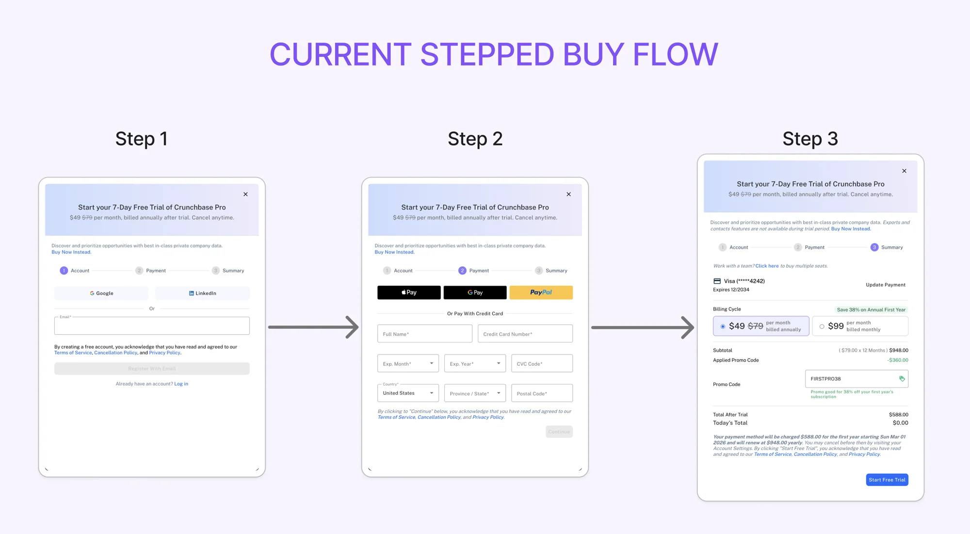
At the center of the self serve Pro plan flow was a 3 step modal that opened when a user clicked on an upsell to start a trial or purchase a plan:
Step 1: Create an account or login
Step 2: Payment
Step 3: Summary, selecting billing cycle & seat count
The stepped buyflow may have been contributing to the drop, specifically its lack of transparency around price and plan context. The flow defaults to annual, hides the monthly option until step 3, and until a recent fix didn't show pricing to anonymous users until step 3 either. Even after adding price info, users still lacked enough surrounding context to understand what they were paying for.
How might we give users the context and choice they need earlier in the buy flow, without adding friction?
Outcome
Anatomy of the Previous Modal
Why a Modal, and How It Changed
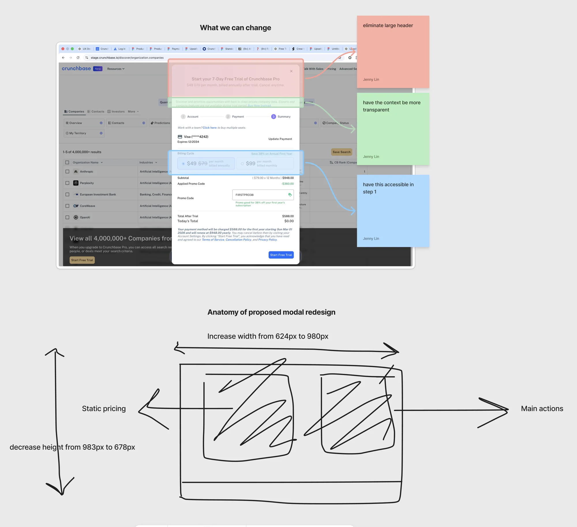
My biggest concern when we first moved to a modal buy flow was fitting an entire buy page into a modal. The trade-off was worth it: users stay on the page they clicked from, instead of being pulled into a disruptive new page.
The proposed fix widened the modal from 624px to 980px and reduced its height from 983px to 678px, eliminating scroll and giving room for pricing and plan context to live above the fold. Key changes:
- Price is now visible on the first step, not gated behind step 3
- Users can toggle between annual and monthly at any step, not just the last one
- The oversized header was cut down to make room for more transparent context earlier in the flow
Solution
The Proposed Modal
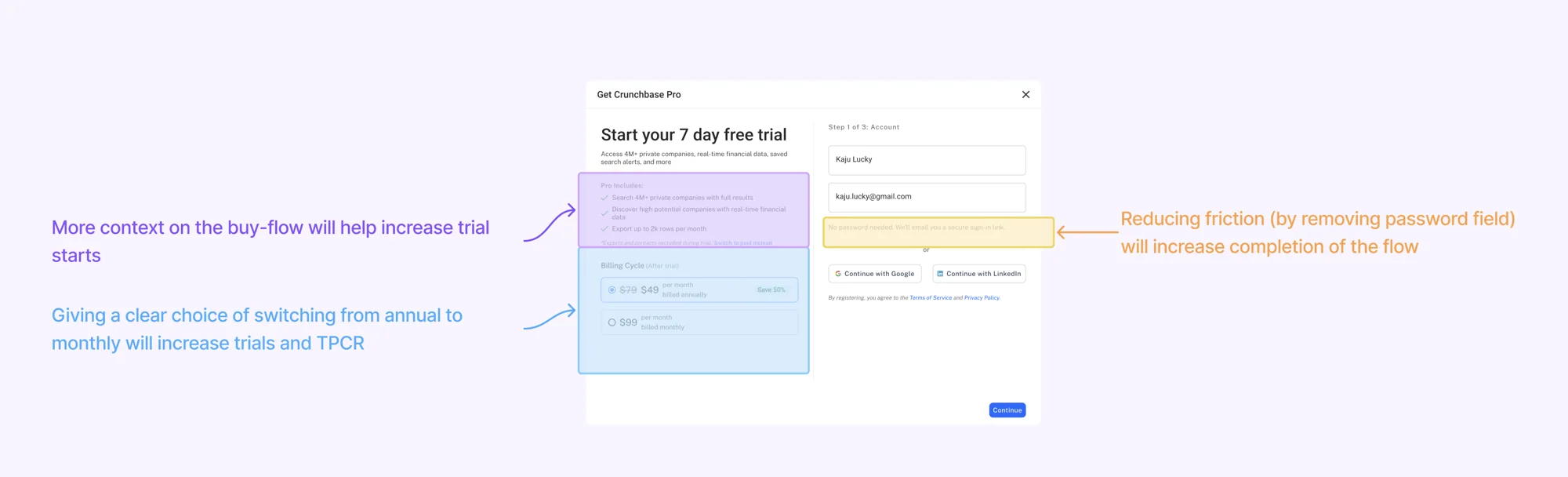
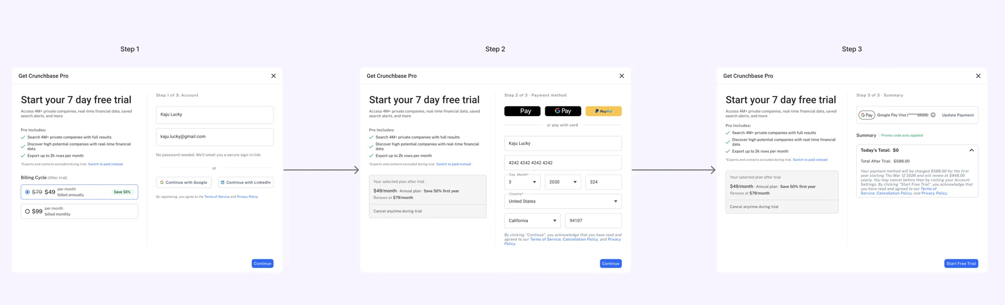
The redesigned flow keeps a persistent context panel visible on the left side of every step, showing what's included in Pro and a live summary of the user's selected plan. The selected plan and its terms also stay visible through payment and summary, so a user filling out card details on step 2 never loses sight of what they agreed to on step 1.
Breakdown of changes:
- More context, earlier. Pricing and plan details now live on step 1 instead of being revealed only at step 3, so users choose their plan before they've invested any effort in the flow.
- A clear annual to monthly toggle. Users can switch between billing cycles at any step, not just the last one, addressing the hypothesis that clearer choice would improve both trial starts and TPCR.
- Less friction to start. The password field is removed entirely. Step 1 asks for name and email only, with a secure sign in link sent by email, or Google/LinkedIn sign in.
Process
Considering a 2 Step Modal
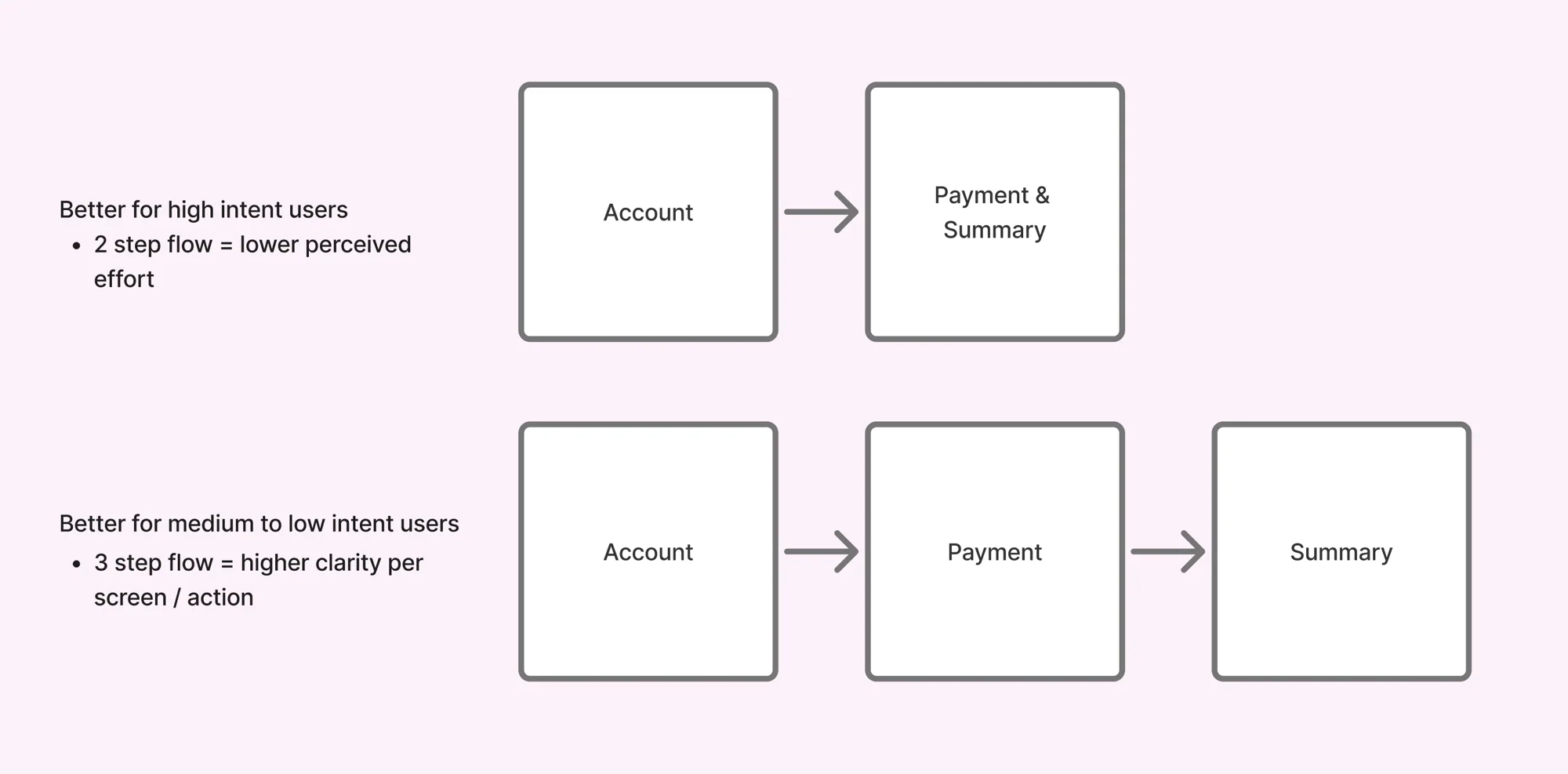
One early direction: collapse the modal from 3 steps to 2, combining payment and summary.
The question: does fewer steps increase progression to summary without adding cognitive load?
Two funnels, two intent levels
Select Product page (high intent, users already decided)
- Page to purchase modal: 22%
- Modal to summary: 43%
- Summary to trial start: 83%
Discovery modal (the one being redesigned, users still exploring)
- Modal to summary: 11%
- Summary to trial start: 58%
At an 11% progression rate, 1,000 users hitting this modal breaks down to roughly 25% high intent, 35% medium intent, 40% low intent, confirming most traffic here wasn't ready to buy yet.
Trade-off
- 2 step: lower effort, best for high intent users
- 3 step: more clarity per screen, best for medium/low intent users
Decision: kept the 3 step structure, since this modal mostly reaches medium and low intent users, but redesigned it to front load pricing and context instead of saving it for the last step.
Iterating on Layout Structure
Several layout variations were tested to get weaker ideas out of the way before landing on the final structure.
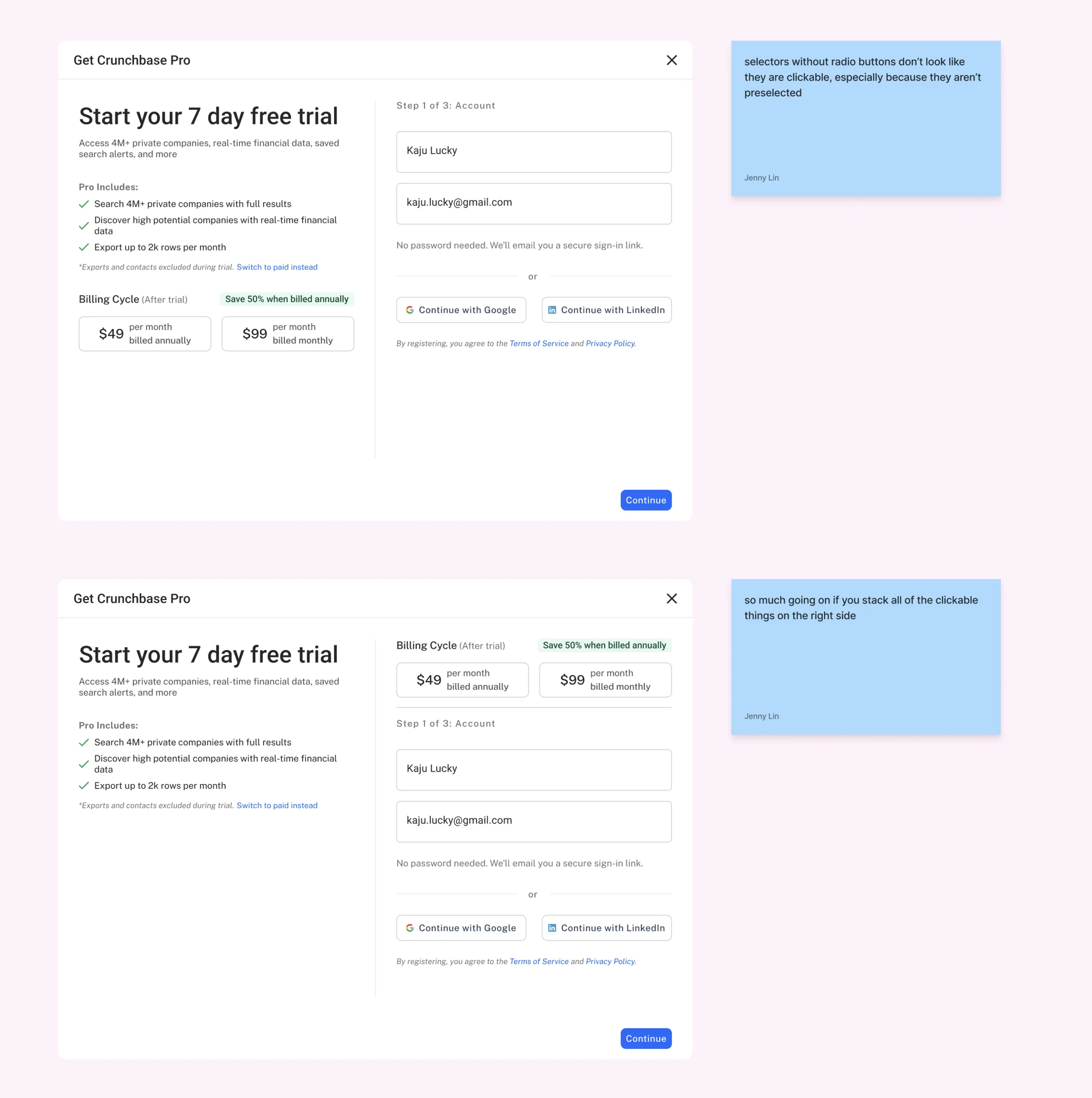
- Selectors without radio buttons don't read as clickable. Early billing cycle options looked like static cards rather than interactive choices, especially with nothing preselected. Adding radio buttons and a selected state made the clickable affordance clear and saved some users an extra click if they preferred the pre-selected option.
- Stacking too many clickable elements on one side overwhelms the layout. A version with billing cycle, account fields, and social sign in all competing for attention on the right side felt cluttered. Spacing those decisions out, and giving billing cycle its own clear visual moment, reduced the noise.
The final structure keeps one primary decision per section: plan selection, then account details, with supporting content (Pro's feature list) anchored on the left throughout.
Getting the Read Only Summary Right
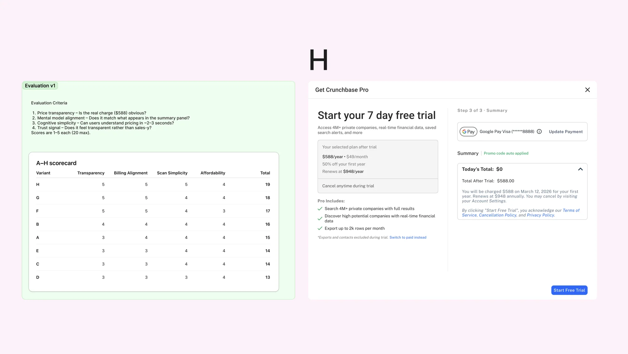
Once a user selects their plan in step 1, that selection becomes read only in steps 2 and 3, shown in a grey summary panel. Getting this small element right mattered: it's the only reminder of what someone is paying for while they're entering payment details.
Eight variants (A through H) were scored against four criteria, each rated 1 to 5:
- Price transparency: is the real charge ($588) obvious?
- Mental model alignment: does it match what appears in the summary panel?
- Cognitive simplicity: can users understand the pricing in about 2 to 3 seconds?
- Trust signal: does it read as transparent rather than sales-y?
Variant H scored highest at 19 out of 20, transparency, billing alignment, and scan simplicity all scored 5, affordability scored 4. It became the final pattern: a grey panel showing the selected plan, its price, first year discount, and renewal rate, with a persistent "cancel anytime during trial" line underneath.