Overview
Opportunity

MONC XIII is a luxury interior design store in Sag Harbor, NY with an e-commerce website that has opportunities for improvement in visual design as well as usability.
Outcome
Research
Identifying Opportunities for Improvement
Beyond the benefits of visually aligning the website with their physical store, I also wanted to identify usability gaps. I conducted an extensive contextual inquiry of their physical location and interviewed store employees as well as Interior Designers.
Interior Designer User Journey
Since the main users are Interior Designers, I needed to understand their user journey and where MONC XIII comes into play. After the interviews, I gathered three major pain-points.
- They’re limited by dimension since they work with physical spaces. No matter how many couches MONC XIII lists, they’re limited to which couch is able to fit into the space.
- They’re limited by item availability since their projects are time sensitive.
- They might be limited by budget so discussing prices of items with clients and receiving approval of purchase is part of their journey.
| Project progress | Will they use MONC XIII | Details |
|---|---|---|
| 1. Project Generation | Yes | Visual inspiration |
| 2. Sourcing items | Yes | Creates a moodboard with online product images, makes list of links, print / download tear sheets |
| 3. Collaborating with Clients | Yes | Presents moodboard with online product images, shares lists of products, shows tear sheets and might modify any from the above |
| 4. Purchasing items | Yes | Has to go to website to purchase |
| 5. Waiting for Delivery | No | |
| 6. Arrival | No |
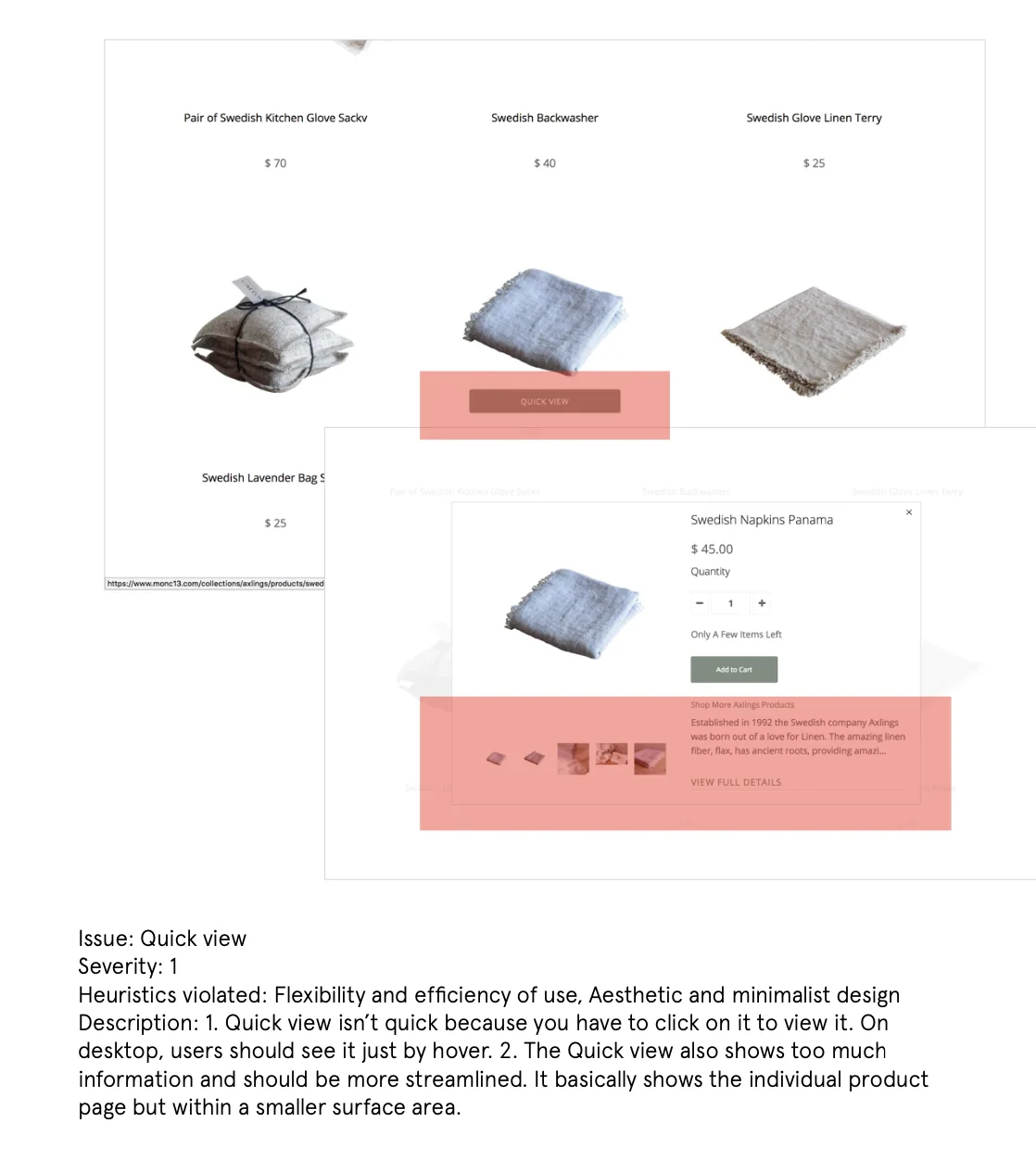
Heuristic Analysis
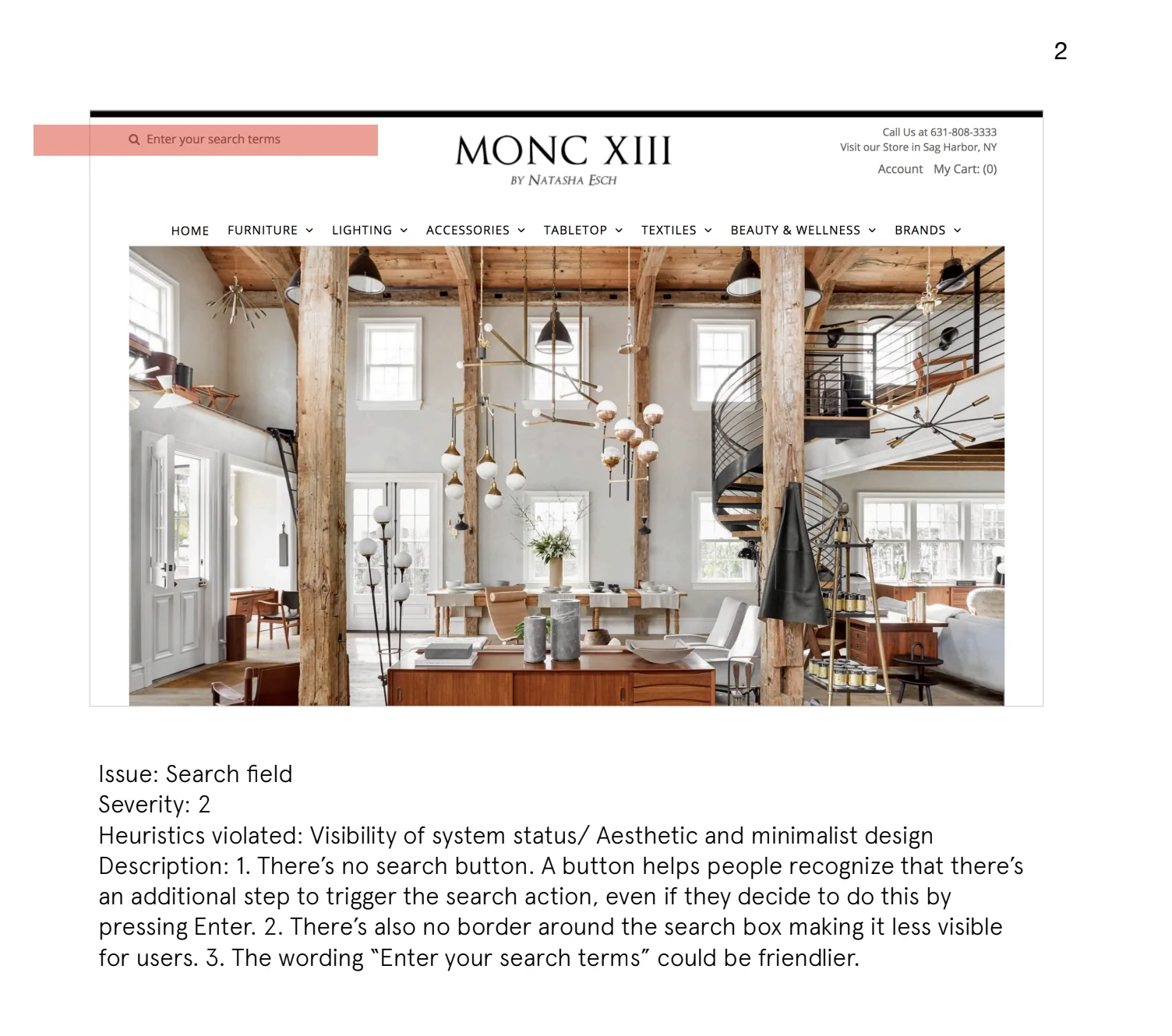
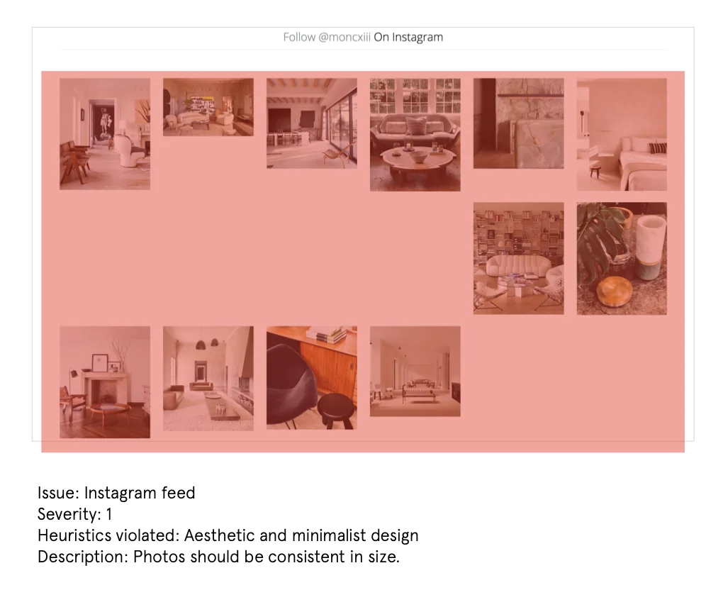
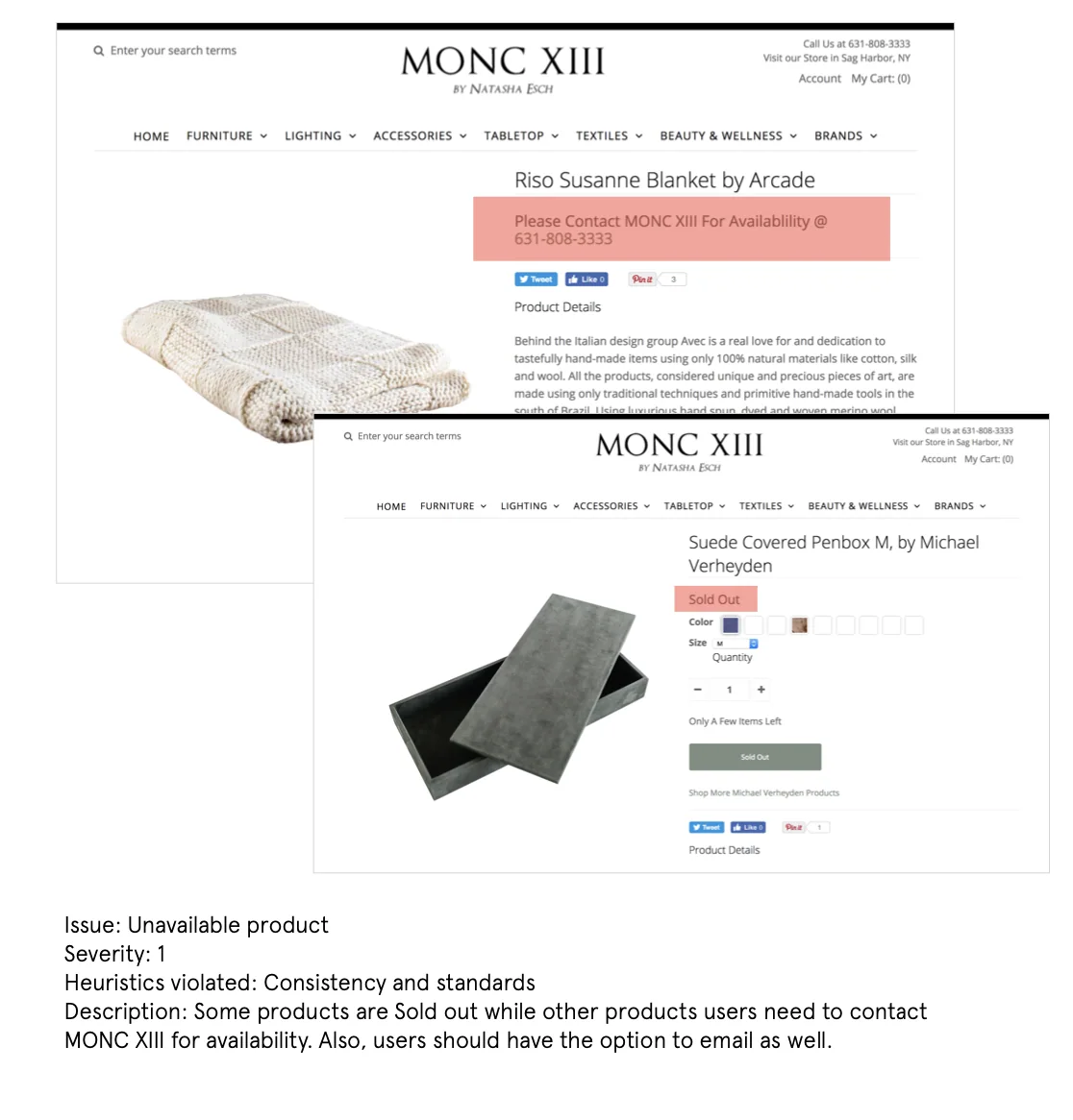
Below are some areas of improvement I took into consideration for the redesign.
Competitive Analysis
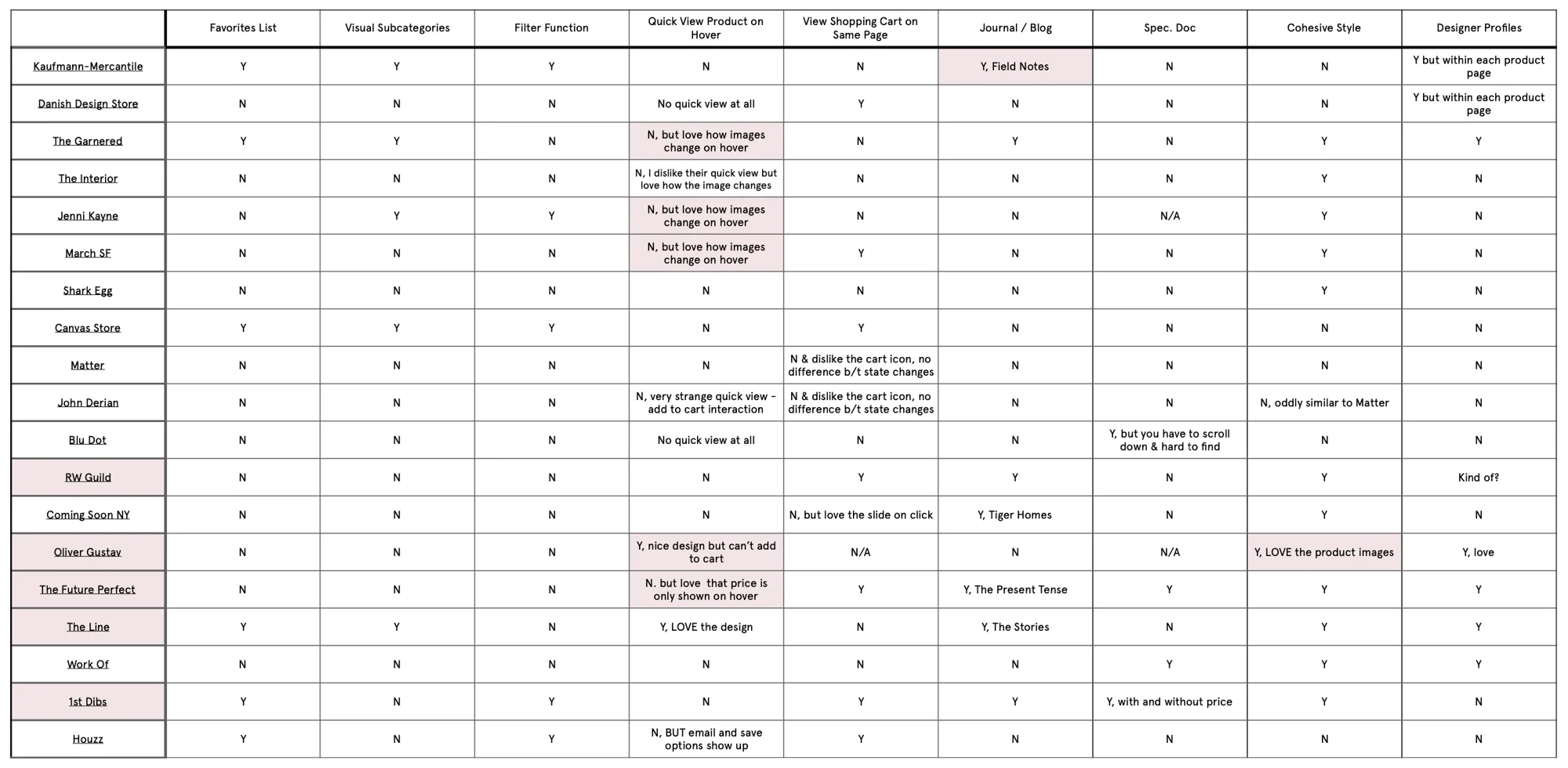
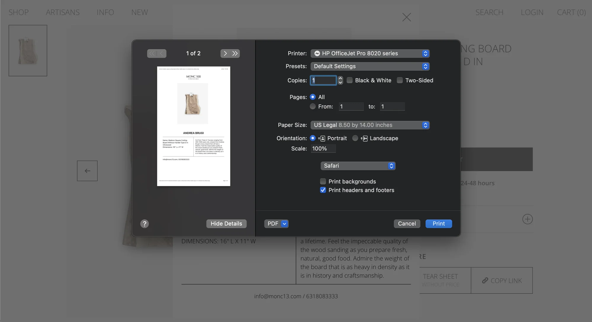
I also mapped features / functions that stakeholders and users mentioned during interviews that were either necessary or nice-to-have and compared the list to similar stores. Not many competitors had the Quick View functionality or the Spec Doc. / Tear Sheets AKA a printable sheet with product information (dimension, pricing, color, material, etc.) and after discussing with the stakeholders, we decided these two features would separate MONC XIII from the competition.
Eye Tracking for a Grid Layout
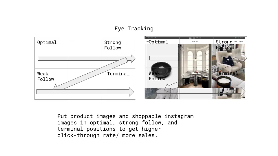
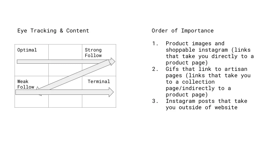
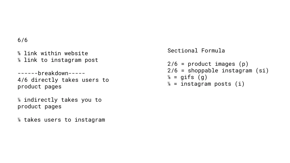
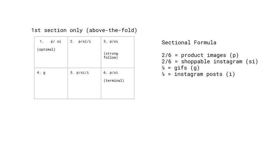
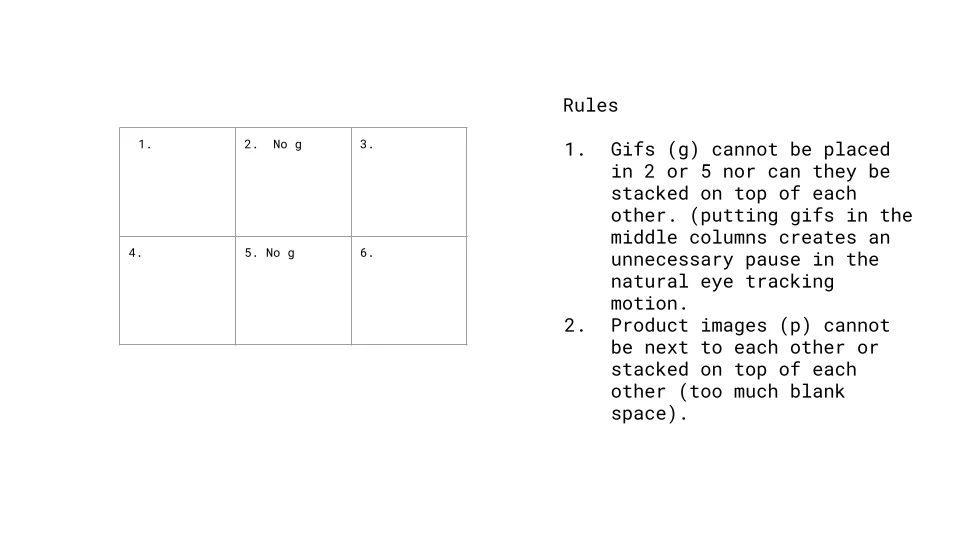
The one non-negotiable ask specifically by the CEO was a grid layout similar to Instagram with a mixture of different content. These included photos that take users directly to a product page, gifs/photos that link to a collection page, and Instagram posts. One of the challenges was to incorporate the different types of content but use best practices so it’s not overwhelming. I researched eye tracking for scalability to create a formula for updating homepage content.
Design
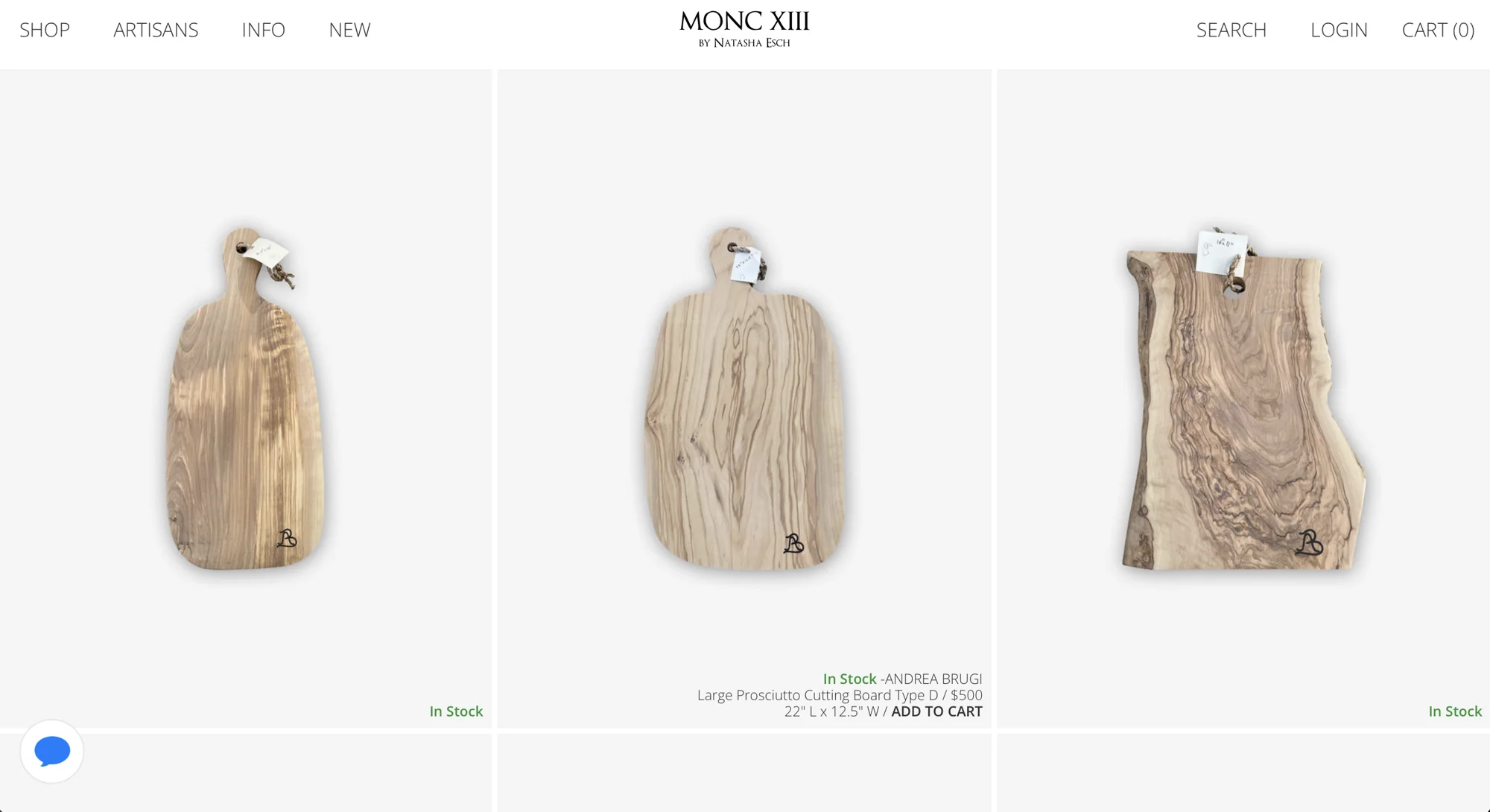
Surfacing Stock and Dimensions
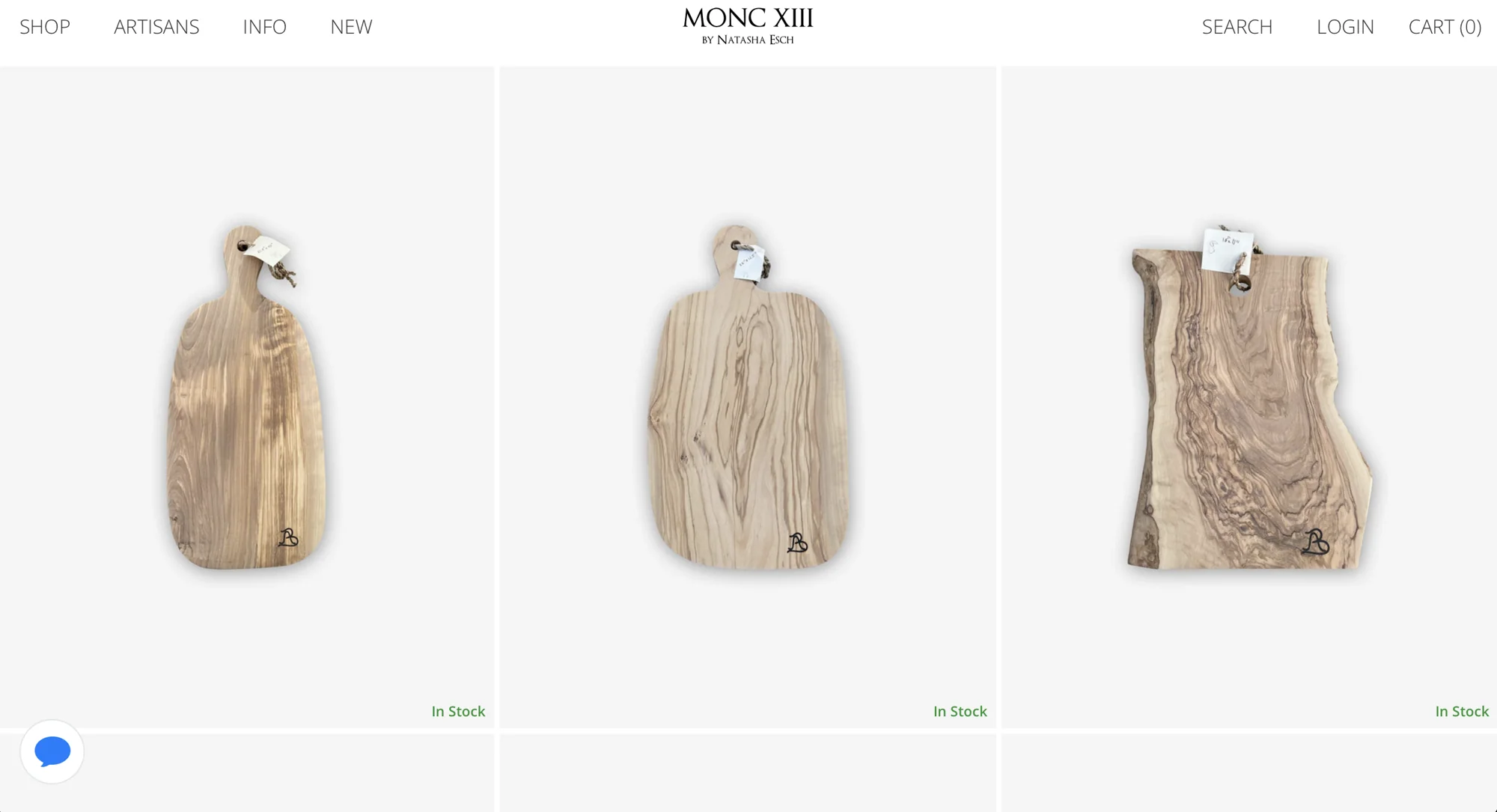
Opportunity: In-stock availability and item dimensions need to have more visibility.
Solution: Display stock availability and item dimensions on quick view that is visible on hover.
Sharing with Clients
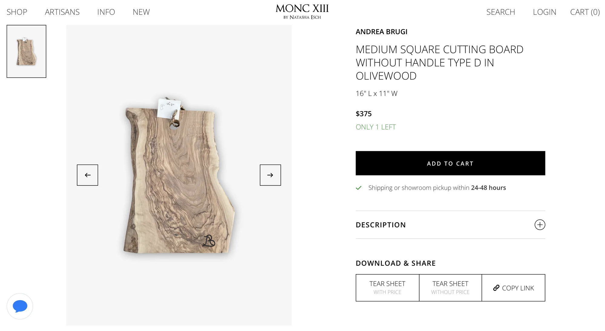
Opportunity: Interior Designers would take screenshots from the website to show clients different options and/or manually copy and paste links to items.
Solution: Adding buttons for printing tear sheet information and copying links to facilitate the user journey of Interior Designers when they’re collaborating with clients and discussing pricing.
Redesigning the Homepage
Opportunity: The previous design had a large hero image that didn’t showcase the variety of products.
Solution: An interactive homepage with a 3 column grid. Navigation hides on scroll and Quick View is visible on hover.