Overview
Opportunity
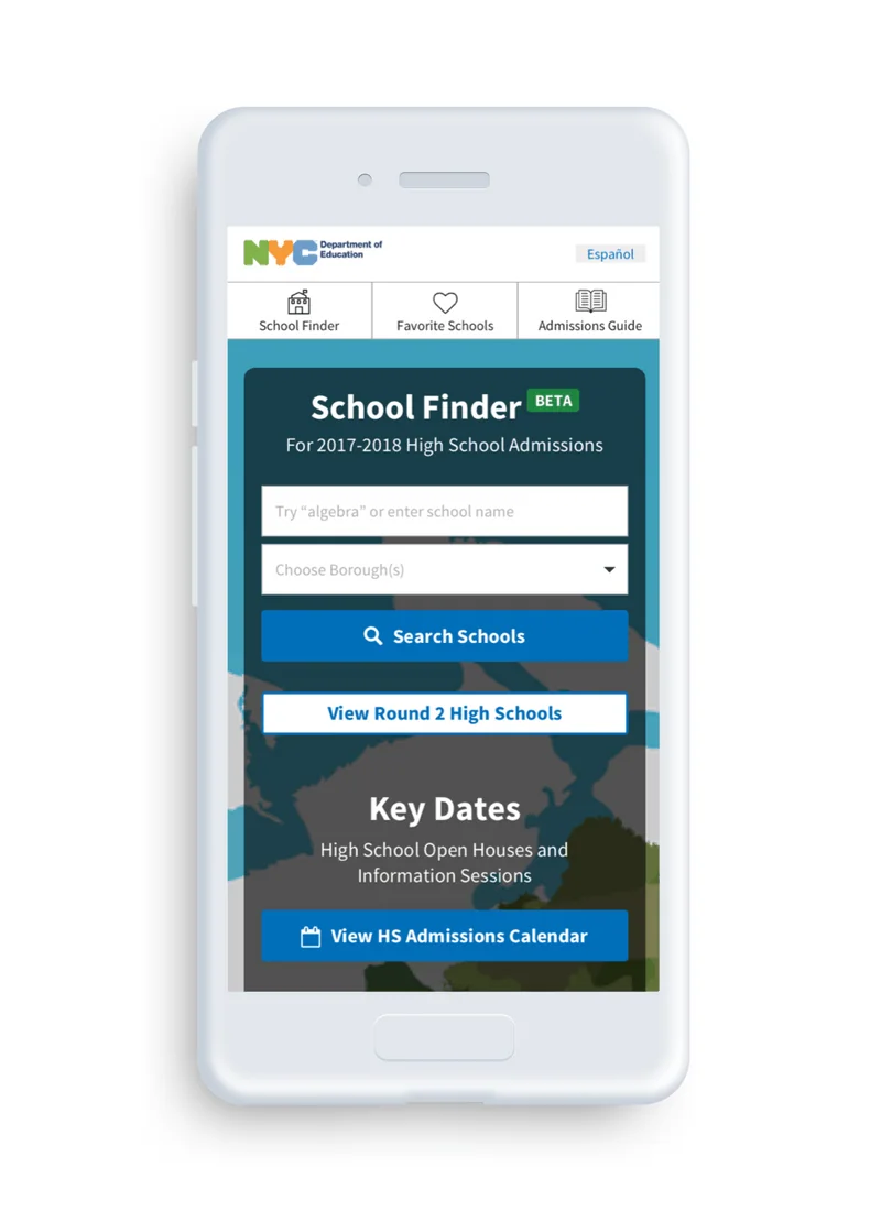
The NYC Department of Education’s School Finder is a website that allows users to search, explore, and favorite high schools. It functions as the digital version of the NYC high school print directory.
How might we help students and family members understand and navigate their way through the high school admissions process?
Outcome
Research
Synthesis + Analysis
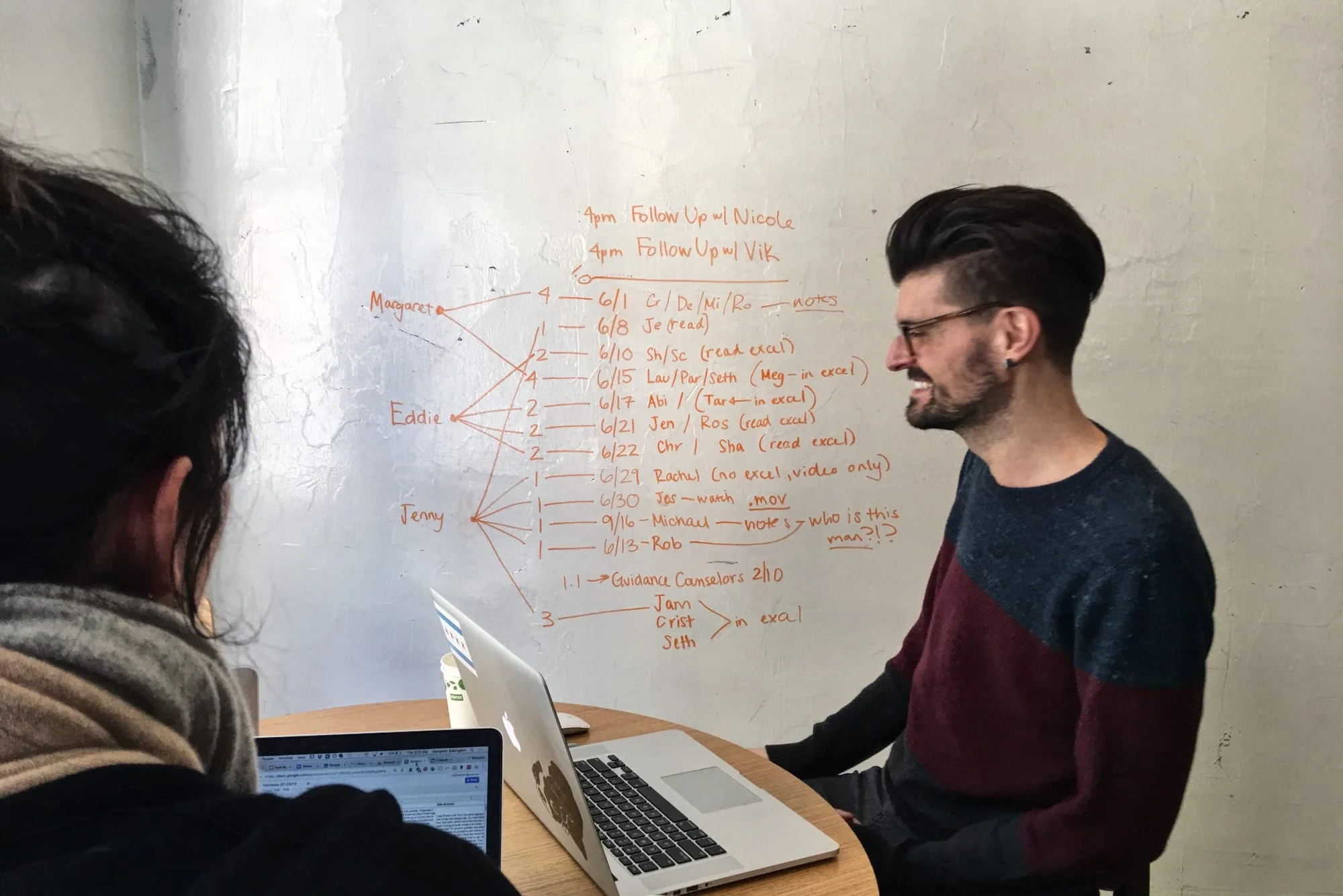
- We synthesized 16 past interviews and 8 usability tests provided by the Department of Education.
Interviews
- We interviewed 4 Guidance Counselors across different boroughs and 3 Department of Education Staff Members.
Contextual Inquiry
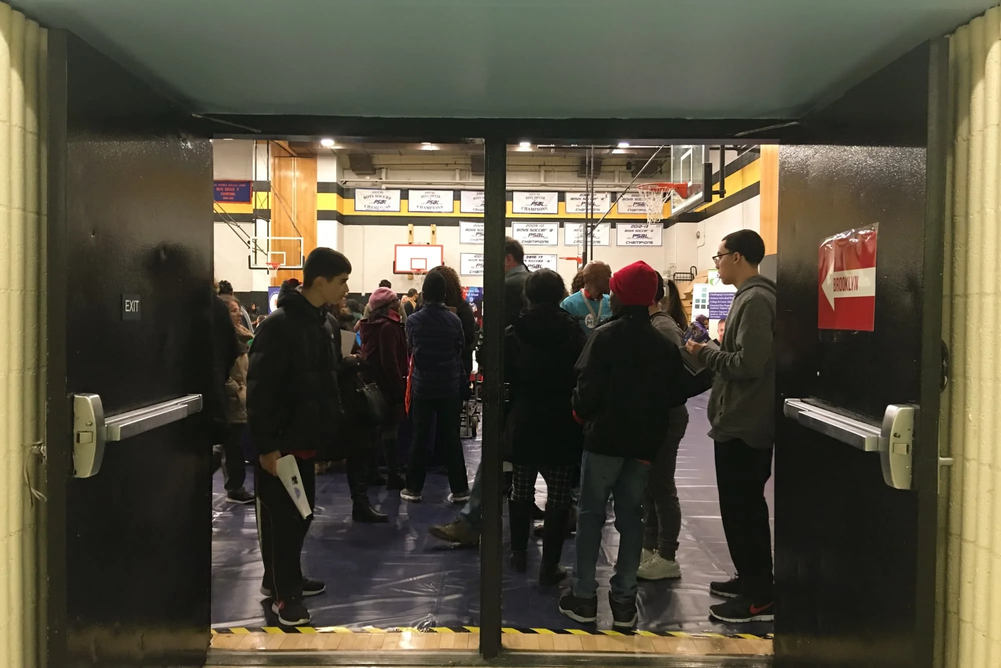
- We visited a Round 2 fair.
Findings
- Families rely heavily on word-of-mouth about how to get into schools and inaccurate information is frequently passed around.
- Many families lack the time, resources and tech empathy to research the 700 programs offered.
- Tracking important dates and deadlines is a difficult task.
- Students, families and counselors have a hard time creating, saving and sharing lists of schools they're interested in.

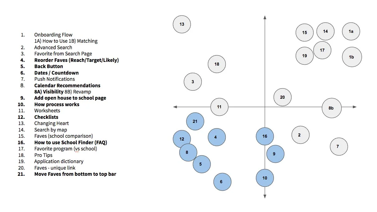
Feature Prioritization
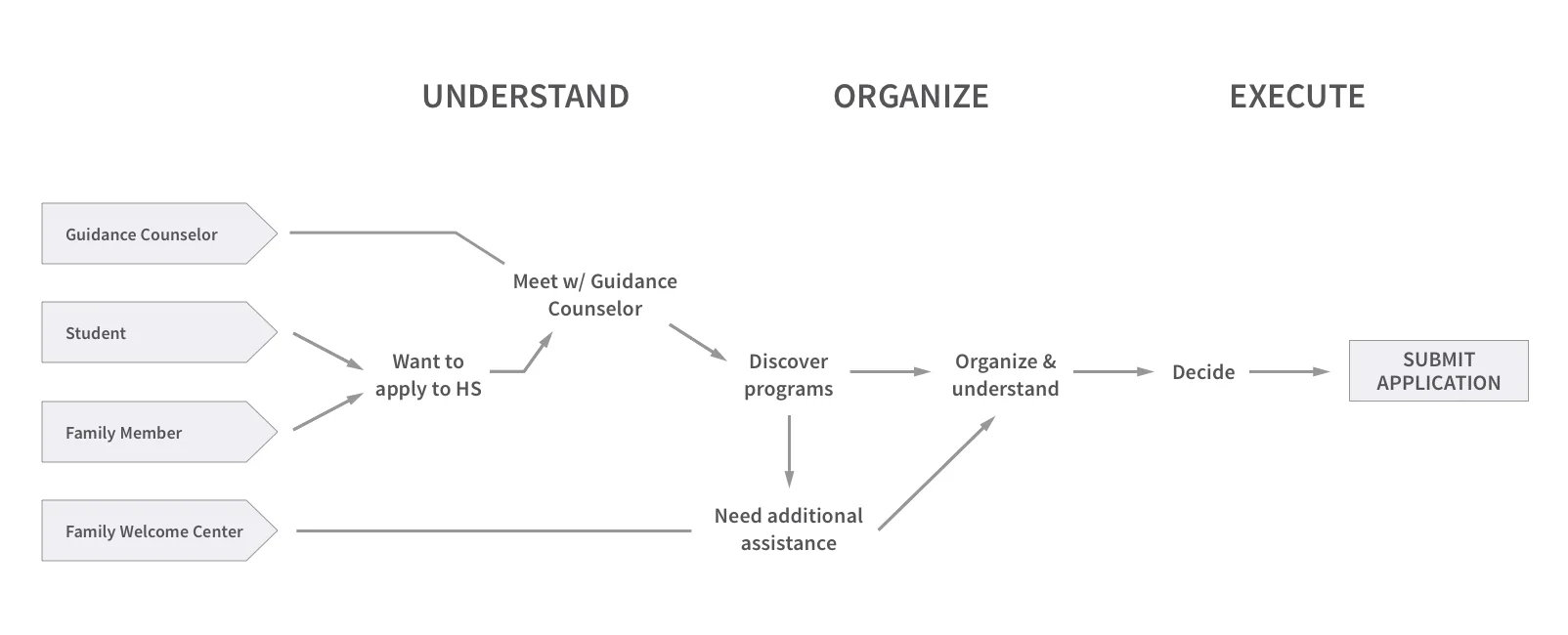
Synthesis
- As a Guidance Counselor/ Department of Education Staff Member, I need an easier way to: educate each student/ family about the overall admissions process as well as the different types of admissions methods and communicate key dates and deadlines.
- As a student and/or family member, I need to: understand the overall admissions process, the different types of admissions methods, and be aware of key dates and deadlines.
Findings
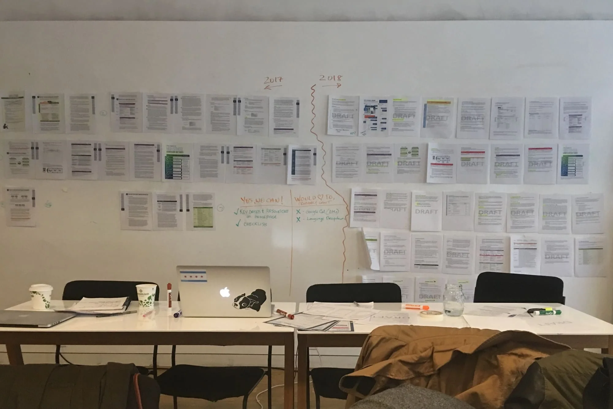
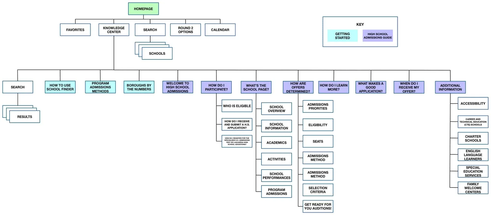
- The most important feature was integrating the front portion of the print directory that held explanations of the admissions process.
- Based on our findings from research, we also added new features and made a few modifications to increase clarity and usability. This includes creating a global navigation and making changes to the homepage, favorites page, and Individual school pages.
Usability Testing Script
- Before you start this, can you tell us a little about your current role in the admissions process?
- Can you tell us a little about your current use of School Finder?
- How do you currently motivate students and families to get involved and proactive about the HS admissions process?
- How do you suggest a student apply to a variety of schools?
- What vocabulary do you use?
- Please spend five minutes exploring the app like you normally would.
- What would you expect to be able to do with a school search engine?
Usability Testing Statements
- So why don't we take a look at this, we're gonna hand the phone over to you.
- Feel free to click around– not everything is necessarily going to work and if something doesn't, I might ask you what you would expect to happen when you clicked it and it did the thing you thought it was going to do.
- If you could speak out loud and walk us through your thoughts about what you're seeing, that would be great. But before we go anywhere, can you kind of tell me what you're looking at.
- What do you see on the screen. What else do you think you can do on this page?
- What else do you see here?
- Main Page - Key Dates - Calendar Button - Navigation menu
You want to search for [____] and save the school and send your saved list to a parent.
- What does the heart mean to you?
- You are walking a parent through SF for the first time and would like to sign them up for email updates from the DOE about the admissions process. How might you do that?
- Find the open house for [insert HS name here]
- Suspend reality for a moment and pretend this is your first time on school finder but you're not sure how to use it. How would you figure out how to use the site?
- You want to view your saved schools. How would you do that?
- Let's do a scenario. Pretend for a moment, you are suggesting school finder to a family who is new to the admissions process– and you know they're taking in a lot of new information and you'd like to point them towards a ways to learn more.
Selected Responses
Usability Testing Highlights
Hamburgers Are Food, not Fun
Our first iteration for navigation incorporated a hamburger icon. We assumed that everyone would either know what was behind it, or have the bandwidth to learn. We were wrong and learned that ultimately hidden content = less discoverability.
What's in a Name?
The Admissions Guide used to have a different name. In our earliest iterations, it went by "The Knowledge Center" but just to be sure, I a/b tested 12 different variations. "Admissions Guide" and "Admissions Information" were tied for 1st place. One tester said: "Admissions Guide is like Good, someone has thought about what I need to do and Admissions Information is like someone is going to give me a ton of information."
Equity, not Equality
Designing for equity is designing with empathy. We kept in mind that the users who would most benefit from the website are low-income families that don't have access to outside resources and assistance. So when we tested the name for the Admissions Guide, we included users from various language backgrounds. And when we designed the Favorites Page, we made sure to add more sharing functionality so students can send their choices to Guidance Counselors before they meet with them.
Design
Admissions Guide
The Admissions Guide is a space within School Finder and is accessible through the global navigation. It integrates the admissions process from the current print directory so users can access key information and questions


Global Navigation
Provides accessibility and findability to the Homepage, Favorites Page and Admissions Guide.

Homepage
Added dates from the directory and application as well as a link to the city-wide Admissions Calendar. This serves as a visible reminder for key dates and deadlines.

School Page
Moved the Favorites heart icon towards the middle of the page for more visibility and highlighted the Program Code to increase findability.

Favorites Page
Added Reach/ Target/ Likely sections and provided the functionality to reorder favorite schools. We also added copy, link, and share buttons.The new functionality will improve diversity of programs students list on their application and remind them that you SHOULD apply to a range of programs.