Redesigning the Cancellation Flow for Click-to-Cancel Compliance
A compliance deadline exposed a quieter problem: our save screen was keeping customers by accident. I used the deadline to fix both, replacing a misleading screen with an honest 25% offer.
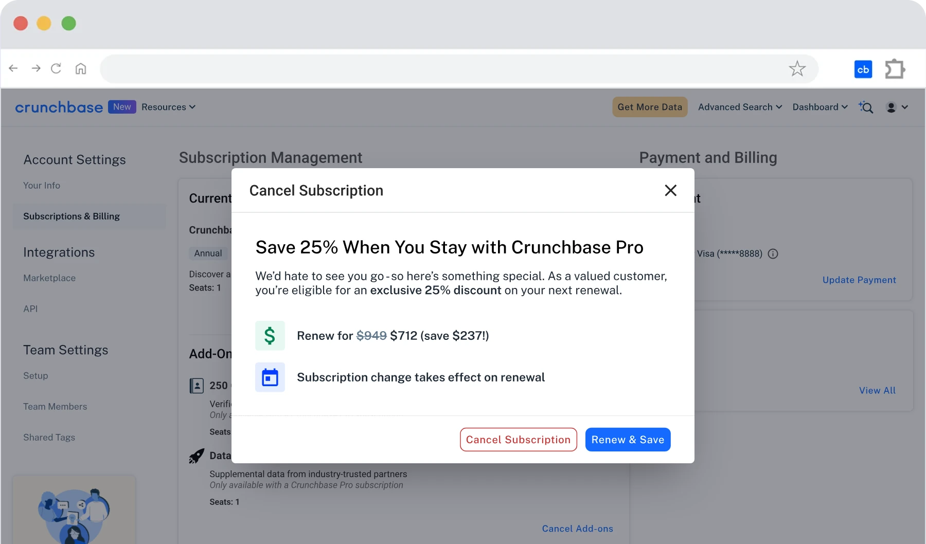
- 11%of people who started cancelling took the 25% discount, replacing a misleading 3% save rate
- 0support tickets about accidental plan switches after launch
- On timePhase 1 shipped by the May 14, 2025 compliance deadline
01Problem
The Opportunity
- A legal requirementThe FTC’s click-to-cancel rule and California law required cancelling to be as easy as signing up, by May 14, 2025.
- Customer complaintsUsers thought they’d cancelled but hadn’t. A “Continue to Switch” button changed their billing instantly, quietly propping up a 3% save rate.
02Insight
Why People Cancel
I mapped cancel reasons with customer support and studied how five subscription products handle cancelling. Then I surveyed 25 users on UserTesting to settle the open questions:
- 20 of 25expected billing controls in Account Settings, not inside the cancel flow
- 80% vs 12%said a discount would keep them, compared with switching to monthly
- 84% vs 56%said they’d skip a feedback survey mid-cancellation, compared with after
03Ownership
Compliant First, Better After
The research pointed to a bigger redesign than the deadline allowed. So I split the work in two:
- Phase 1: Ship complianceMeet the May 14 deadline and give people an honest way out. Minimal changes, no risk to the date.
- Phase 2: Fix the save mechanicReplace the monthly switch with the discount users wanted, and measure it.
Splitting it protected the deadline, but kept the old monthly offer live a little longer.
04Design decisions
Phase 1: Ship Compliance
Four small changes, each clearing the way to the exit:
- The plan checkbox came preselected.
- The cancellation survey became optional.
- The “you’ll lose access” page was removed.
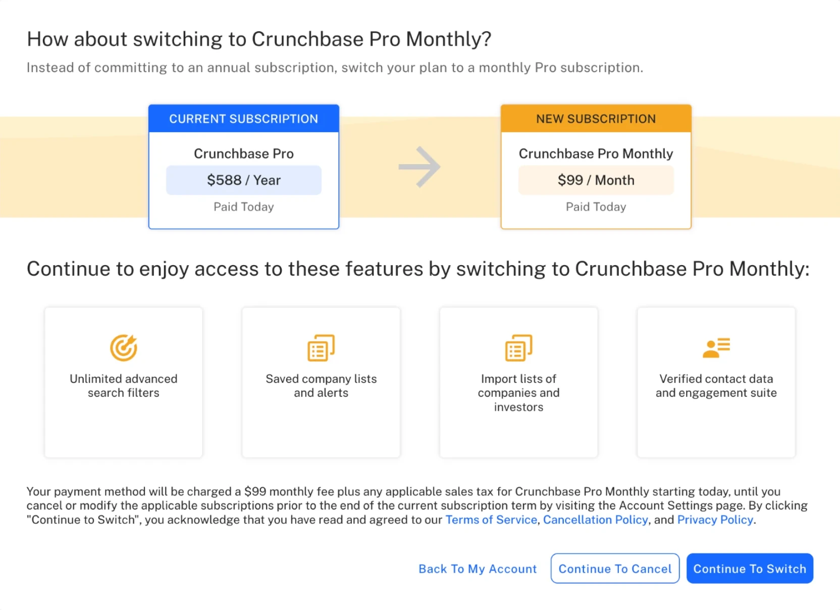
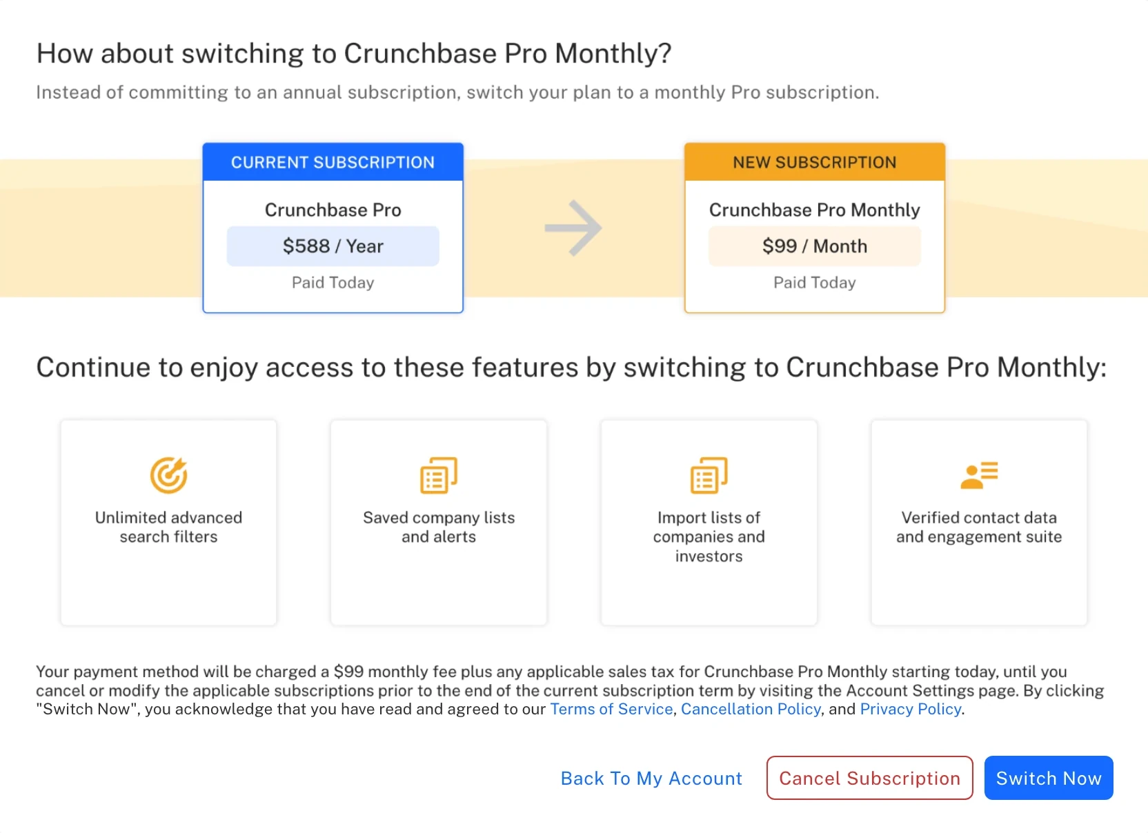
- The switch-to-monthly offer’s buttons were redesigned to say what they do: “Switch Now” to switch, and a red “Cancel Subscription” to leave.
05Design decisions
Phase 2: Redesign, Not Just Fix
Phase 2 gave each job its own path, so cancelling stopped carrying weight that belonged elsewhere.
- Billing changes, outside cancelSwitching to monthly moved to Account Settings.
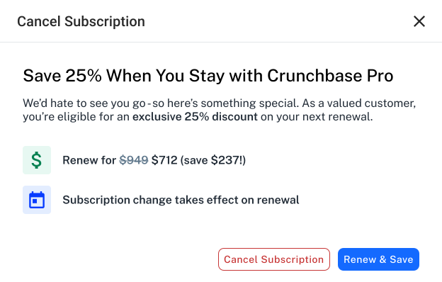
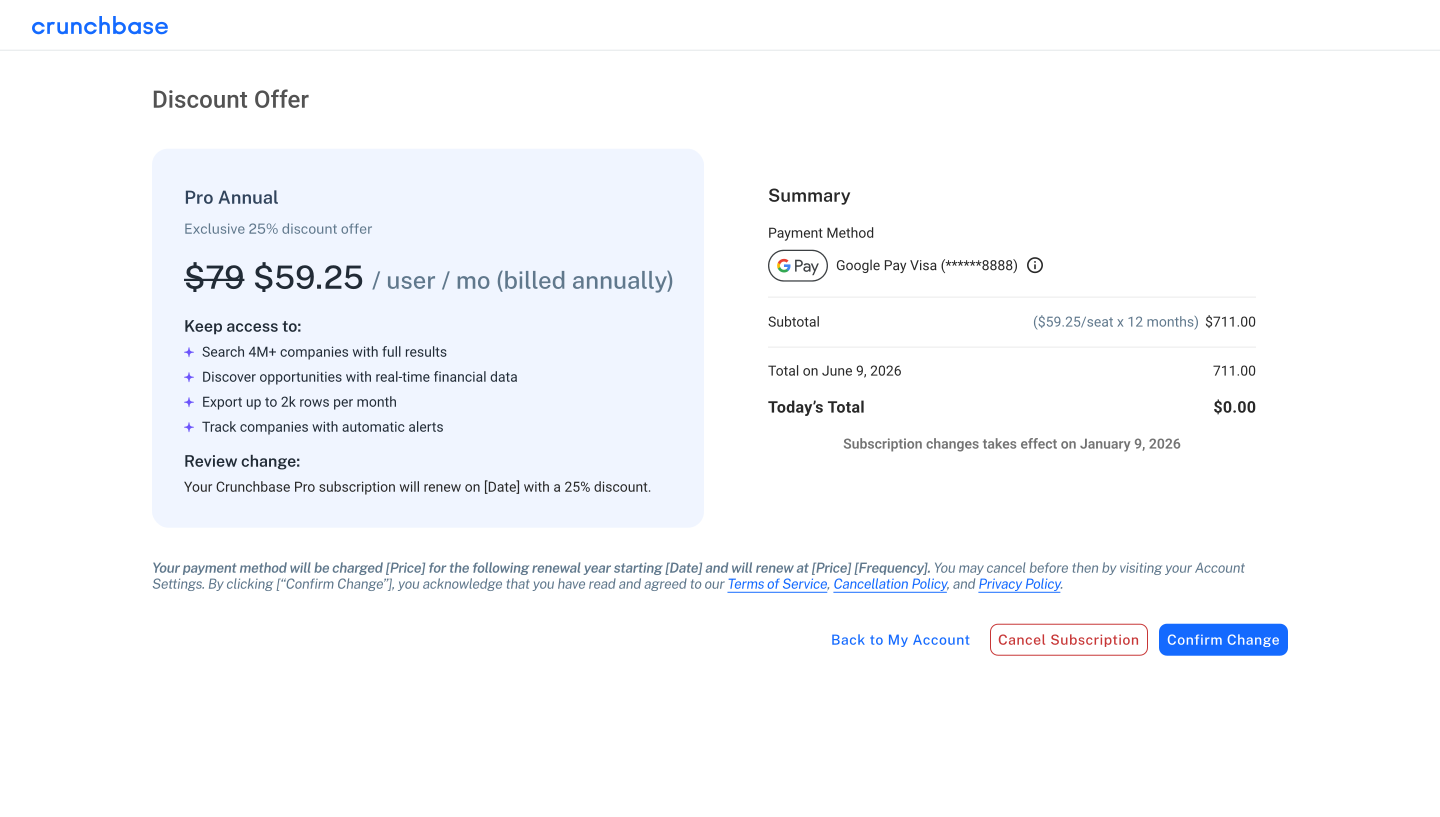
- An honest save offerThe monthly switch became a straightforward 25% discount.
- Feedback, afterThe survey moved onto the confirmation page.
For the offer, a small modal was simpler, but trust was the bigger risk at that moment. So a light modal makes the offer, then a full-page review shows exactly what you’ll pay before you commit.
06Influence
Shaping the Cancel Modal
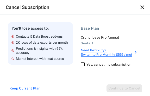
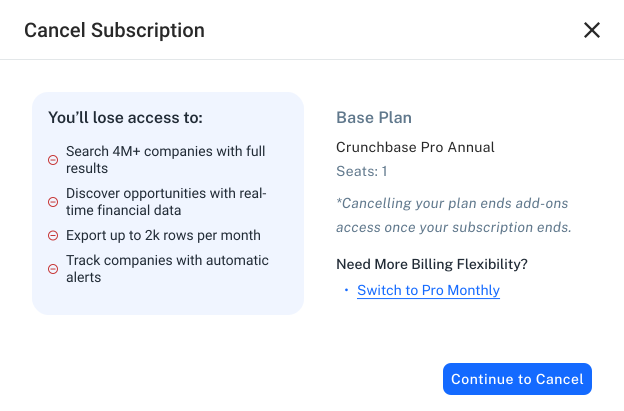
The new cancel modal went through three versions. Legal confirmed a required “Yes, cancel” checkbox could go, design review shortened the monthly link, and PM, PMM and Engineering helped rewrite the loss list around outcomes.
07Impact
What It Led To
- Phase 1Shipped on time for the May 14 deadline, with 0 support tickets about accidental plan switches after launch.
- Phase 211% of people who started cancelling took the 25% discount, replacing a misleading 3% save rate.
Two months later, the Eighth Circuit vacated the FTC rule. The simpler flow stayed.
Phase 2 was measured over a 4-week pre/post comparison, not a controlled test.
08Reflection
What I’d Do Differently
I’d test each change on its own.
The pre/post covered both the new cancel modal and the discount, so I can’t say how much of the 11% came from each. Next time I’d work with Analytics to track them separately, and set up tracking before launch.
Next case study
 NYC Department of Education
School Finder NYC
An Admissions Guide for 80,000 students and the families helping them.
Read the case study